


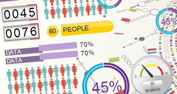
Let’s face it. Data can be boring. It’s often a conglomerate of a bunch of numbers and decimal points spread across a white page. It doesn’t engage with you; instead you have to make a conscious effort to understand and make sense of it, which is why it’s often hard to retain data.
Presenting data is about retention
Presenting data in a visual manner is not just more appealing but it can be more engaging and in turn improve its retention. This is why at Visme we set out to create a premier category of content tools we like to call “Infograph Widgets”.
What are infograph widgets?
They are simple apps that allow you to visualize data into engaging visual content. You can also mix and match them together or combine with text and other content elements to better represent data.
How they work
Visme’s Infograph widgets are extremely simple. Their entire purpose is to improve the quality of how you represent information and how quickly you create them.
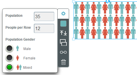
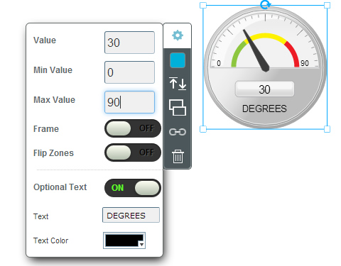
For example creating the graphic from scratch would require one to design the look and feel, extensive time and programming experience to create a working version; however with Visme’s ready to use widgets, you simple drag and drop an infograph to your stage, click it and personalize with your own settings and data (you can control everything from data presented, and color) and in matter of seconds your done.
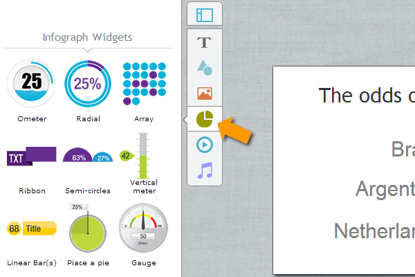
A breakdown of our Infograph Widgets
Check out this slideshow for an insight into each of our infograph widgets. (p.s. the slideshow was created in under 10 minutes using Visme)
what to use Infograph widgets for:
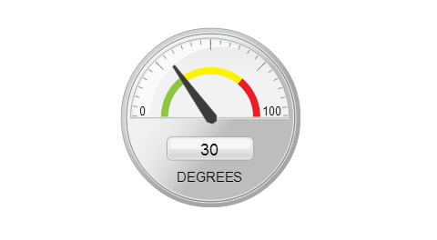
Let’s say you want to show the chances of your favorite team reaching the 2014 world cup finals. Using widgets you can in just a matter of few moments generate a visual representation of your proposed scenario.
What others are doing with Visme’s infograph widgets:
Some users are utilizing infograph widgets in conjunction with other assets to create highly engaging content to better visualize information. Here’s a few examples of what others are doing with Visme’s Infograph widgets:
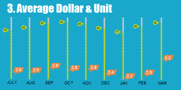
Business Infographic
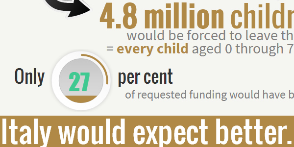
Infographic for a non-profit cause
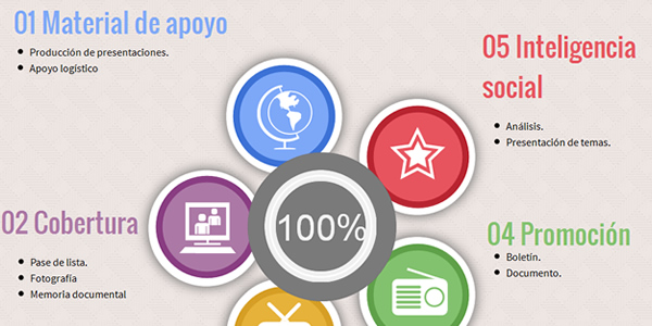
Infographic covering social communication
 Payman Taei is the Founder of HindSite Interactive, an award winning web design and
Pingback: Visualizing data with Infograph Widgets –...