


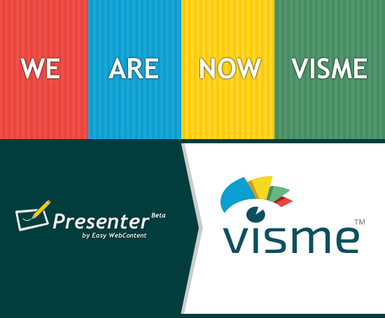
If you haven’t already noticed, our brand has recently changed. As a company we are still Easy WebContent but our flagship product’s name ”EWC Presenter” is now officially called “visme” and for good reason.
Now most of the time this is where most companies stop short of the details. They will show off their new brand and pitch how proud and excited they are of their new name and how it is a reflection of their core values; and then its back to business.
Not this time. Yes we are proud and excited to transition our brand to visme, but we also like to do things a little different here. So today I’m going to dig down under the skin and into the nuts and bolts of why we decided on our name change, and how we made this transition including the entire logo design and selection process.
Why we originally used the name EWC Presenter
Long before a Beta version of our product was launched, we were going to call our new product: “Spark”. It had a flare to it (no pun intended), and given that originally the core function of the app was its animation capabilities, it kind of made sense.
To be honest it was my personal pick and I was pretty much married to it until I decided to consult with the team. As it turns out I lost the majority vote and since we run a democracy here and I rarely practice my veto power against the team, the name Spark never made it out of our office and got swept under the rug. Of course CapitalOne bank’s recent launch of the Spark brand wasn’t helping either.
![]()
So we dumped it and after some name calling settled on “Presenter”. It pretty much said what the app was meant to do. Although as a team we agreed to the name, none of us really loved it; it was too general.
To further complicate things, there was already a few other software/apps with the same name (such as Adobe’s Presenter). So we decided to avoid the confusion by calling our app ”EWC Presenter” which is short for “Easy WebContent Presenter”.
Fast forward to March 2013. By this time we were nearing the Beta release and given our app was going to be evolving we made the conscious decision to stick with EWC Presenter as our interim name and in the future when we have a better reflection of where the app is heading to make our transition to a new brand.
Evolution of our App
Come April 2013 we did a soft launch. Over the course of the next few months, we collected valuable feedback from our growing user base and each day we manually reviewed every project that was being published. which allowed us to see a noticeable trend that was not only a wake up call but has also set the tone for the evolution of our app over the course of the last year.
What was the trend? First I need to note that the entire idea of EWC Presenter was a result of me and my design team at our web agency HindSite Interactive where in 2009 our interactive business took a major hit because of the lack of support for Flash content by mobile devices (Thanks to the late Steve Jobs; you can see the open letter from Jobs here).
Flash if you haven’t heard of it, is an animation tool; and until just a couple years ago, any motion and animated content (ex. Banners, website teasers) that you saw online were made with Flash.
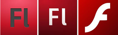
So the entire idea of EWC Presenter was based around creating a simpler version of Adobe Flash in HTML5 the new standard code that requires no plugins and is supported by virtually all devices that connect to the web. Long story short, since HTML5 isn’t a plugin and an extension of HTML (the fabric of the internet) it is here to stay.
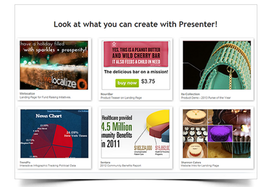
And so not surprisingly we had promoted the App as an animation tool to create animated content on the web. As it turns out most people were not relying on the animation capabilities of our tool but they were primarily using it to create presentations, infographics and other forms of visual content and then as a finishing touch adding interactivity when it was needed.
Reality check: Our audience wasn’t turning out to be mostly designers and animators but instead it urned out to be anyone and everyone from all walks of life: educators, students, marketing professionals, bloggers, small business owners and non profits were creating all sorts of visual content not just animations!
A shift in direction
By October 2013, we made a full switch away from being solely an animation tool, but a visual tool for everyone and to improve user experience we had to take a holistic approach to the features and improvements in the user experience of the app.
December 2013: There is monthly rise in our traffic and growth in user base, we now had a better understanding of what EWC Presenter was and where it would be heading: One App for all your visual content needs.
A new name is born
By this time we were all itching for a name change. We needed something short, sweet and catchy. A name that was fun to say, easy to remember and when you heard it, know how to spell it.
We went through 100′s of names and iterations. First it was fun, then it became annoying and at one point an obsession. Names like Visualway, Contentmatic, Soot, Pesatize, In4m, Reelize, Fyrekit, Flosnap, IWantToP (making sure you’re reading), and even VisualBerry. The list goes on and on…
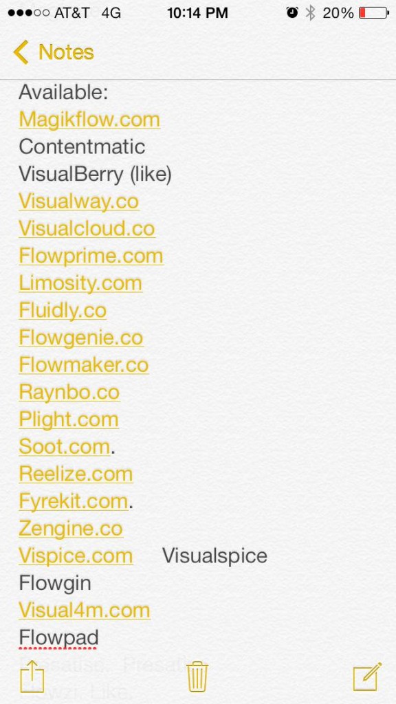
Finding a name we could all agree on became an obsession. A small sample of names I would write anytime I heard something worth jutting down on my iphone.
I think coming up with a brand name is like peeling an onion because it is a multi-layer process and along the way don’t be afraid to shed a few tears.
I love that statement from Shrek explaining the depth of Ogres to Donkey: ”Ogres are like Onions. They have layers”.
1. Come up with a name that is catchy and memorable
2. Confirm if there are competitors and other brands with the same name?
3. Check and see if the domain name is available in a popular extension.
4. Can you trademark the name?
5. Will you agree to it as a team?
I could add a couple more layers in between or switch the order a bit, but as you can see getting past the first step was just the beginning.
About 50% of the names made it past the second step, but only 20% made it to the third step, and about 5% through step 5.
We finally had it down to just a few names where as a company we could agree to:
flosnap
visme
idoo
flowzi
How we did we choose the winner?
We wrote down the names on a piece of paper and had an odd number (5) of our team members vote. At the end the clear winner was visme!
What does it stand for you may ask? Some say it’s short for Visualize Me, some say it’s Visually Me and few other iterations. We leave that to your imagination.
How we created our Logo
Now that we had a name we needed a logo. Some just style their name into a simple clean font style and that often works just fine (think Microsoft, Dell, and many other popular brands large or small).
But we are a visualization tool. Our core, our essence is about giving everyone simple tools and the ability to visualize anything be it an idea, text content or even boring hard to understand data. So we needed something that oozed visualization.
Did we hire an agency to design our logo? Sort of. Visme is incubated out of our Web Agency HindSite Interactive , so naturally we use its design resources when needed to take care of our design needs.
So I put me and one of my closest colleagues Shayan on the task. We began brainstorming what visme is all about and what kind of visual icon could represent it in a cool manner.
When it comes to creating a logo graphic there are some basic principles we like to keep in mind:
- The graphic must be as simple a design as possible.
- Avoid using gradients as much as possible
- It should be an illustration or a drawing not a picture (as that would be too complex)
- It should come in a couple color variations so you can place it over light or dark backgrounds.
Font: Font selection is extremely important to a brand. As noted earlier some brand designs are simply a reflection of a certain font style. We chose a San Serif Google font and then made subtle adjustments to letter edges to remove some of the curves to give it a firmer and more bold feel.
Colors: We settled on using 3-4 solid colors. We wanted the brand to be vibrant, so we chose bright colors: Red, Green, Yellow and Blue.

Design:
Three of the team members sat down and started to brainstorm. It was more like a question and answer session really.
What are we?
What’s our tool about?
What’s the keyword that defines us?
Two words kept popping up:
Visualization , and Data. Based on those we first came up with a series of concepts to serve as a starting point. So we came up with icons that represented one or more of those keywords.

We then tied it down to the concept that we felt the most connection with. We decided to eliminate anything data related because it would make us look too analytic and too “Enterprise” looking. And honestly when I think of enterprise software I think of something boring and tamed.
Given we have such a wide array of audience it made sense we concentrate on the visual aspect of our app more; something catchy; something dare I say, sexy?
We generated a few concepts based on the comp as shown below.
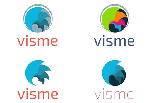
After a few iterations we decided the logo was still missing something; it was too mechanical. It had no emotion. Finally after some further discussions a light bulb went off. Why not combine the multi-color layers (you could say each represents a slide/canvas) to form eyelashes. So below was our next take at forming an eye for Visme:

Now we had the idea in place. We knew this is us and now all that was left was the finalization process. It was clean-up time. After 7 more iterations of the logo with tiny adjustments here and there we had our new brand.
But to cap things off we decided to bring the “Data” element in. Given we had an eye it gave us the opportunity to represent the iris as a pie chart which is achieved with a simple slice of pie cut out of a circle and the eye lashes are formed by simple layer shapes forming the top of the eye lid.
When the icon is placed over the visme name, the iris forms the dot of the letter “i” . Note that at times when we utilize logo on thin margin areas we may place the icon to the left of the visme name.
And the end result:
![]()
There you have it. It wasn’t an overnight decision;. We basically had to peel it layer by layer and took our time to select a brand that we believe is perfect for us and it all started with our users and their feedback to set the tone for transition of our app to reach a larger audience.
What are your thoughts? What do you think of our new Brand? We’d love to hear from you.
 Payman Taei is the Founder of HindSite Interactive, an award winning web design and
A lot more thought than once I’ve ever put in, but it shows.
Great result!
hey Shaun. Thanks; Glad you like it. Of course we never intended to go through this many iterations; but it was definitely worth the time and effort; not only did we create a good brand we’re proud of, but the process and involvement of the team helped us better connect with our product and where we want to go with Visme.
Hallo Payman,
congratulations to your team for the new branding (interesting story) and for the product itself.
I would appreciate if you would be able to tell your customers the conditions of the pricing plan and future features of your product.
For our purposes (insurance broker) we would use your presenter for landing pages, individual product presentations and some banners.
Should we use your presenter or a combination of iWorks (cloud , still beta too) and hype (html 5 tool by tumult)?
I’ll expect your answer, because we have to focus our activities.
Hi Thomas. Thanks for the kind words. We wanted to share with everyone what the branding change involved; often people think it’s just a design of a logo but it can be more involved as you see.
Sure thing about Pricing; We are free and will always be. We are also very soon (Early May 2014) launching Premium plan so those such as yourself can take advantage of premium features including ability to remove our Visme watermark!
So stay tuned for Pricing and features list in very near future.
You won’t need tumult or other HTML5 tools unless you absolutely need them. Because with our tool you can create pretty much anything in HTML5 and embed right into your own website.
Pingback: An inside look of the politics and process of c...
Pingback: An inside look of the politics and process of creating a new brand. |
Pingback: How to change your product brand name - Visme |...
Pingback: An inside look of the politics and process of c...
Pingback: Create online presentations with new features & upgrades Visme