


We’re excited to announce the second phase of our interface upgrade: Responsive Design. A couple weeks ago we launched a brand new interface that has dramatically improved user experience because it is simpler, cleaner and gives the user more real estate for their project area over its predecessor.
Today we have also deployed responsive design to the interface to further improve user experience. Here’s how it works and what it means for you:
Responsive Design
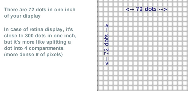
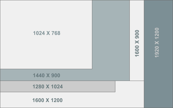
Responsive design is a web design approach aimed at crafting sites to provide an optimal viewing experience. You see, not every screen is born with the same size and resolution. There are numerous display resolutions from 1024X768 to 1600X1200 and higher and each with a different proportion.
p.s. For you non techies out there, to put screen resolutions into perspective, every 72 pixels equals to about 1 inch; so 10 inches is about 720 pixels wide.
This means that one user may have less height on their screen while another may have more width. This variation often causes a different experience from one display size to another in turn giving advantage to one user and disadvantage to another.
It’s a Jungle out there. Displays comes in all sizes so you need flexible design.
To remedy this issue we implemented responsive design to the interface. So regardless of which common resolution you view the application on, you will have the most optimum real estate possible conforming to your display because the UI (user interface) adapts to the resolution it is being displayed on.
Here’s how we achieve this:
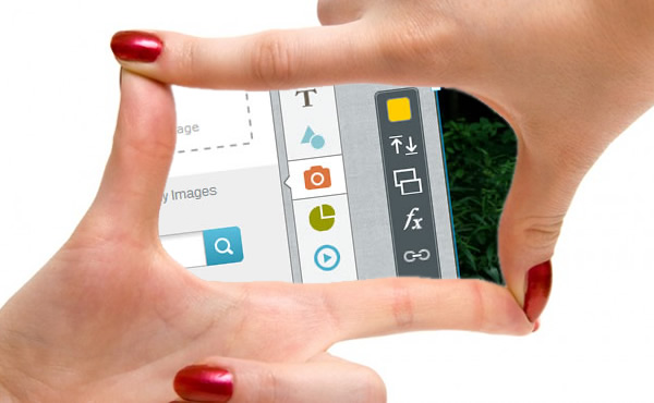
There are three main components in our interface:
1- Left Panel (Where you can access all of your assets)
2- Canvas Area (Your project’s real estate area)
3- Right Panel (Slides Panel)
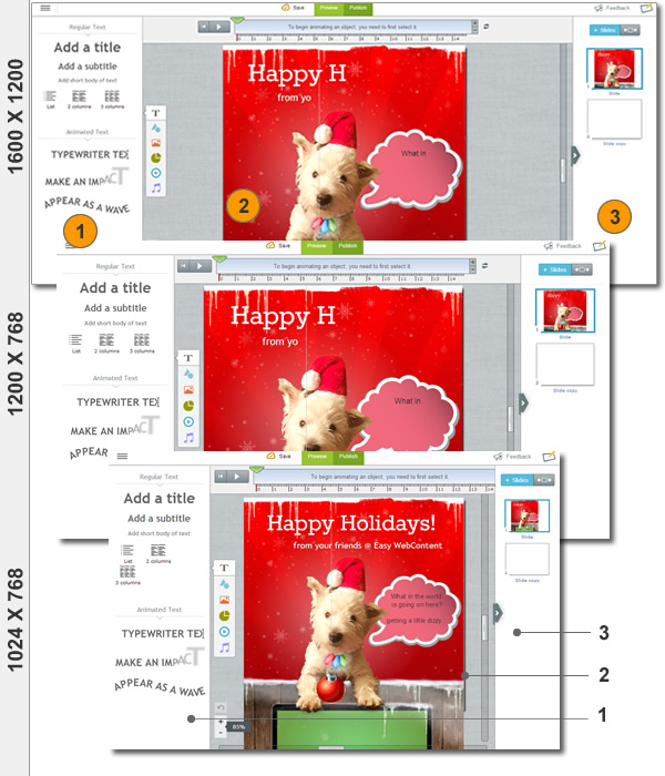
Here’s how the interface will adapt and respond to each resolution it is loaded on.
We achieve responsiveness by adapting the three interface components to adapt to your display size. For example if you are on a smaller width display (ex. 1280 width) you will have the left and right panel reduced in width while the Project area maybe zoomed out to about 75%-80%. With that said a user on a wider display (such as 1440, 1600 or higher) may see full width of their left and right panel and view their stage area at the 100% default setting.
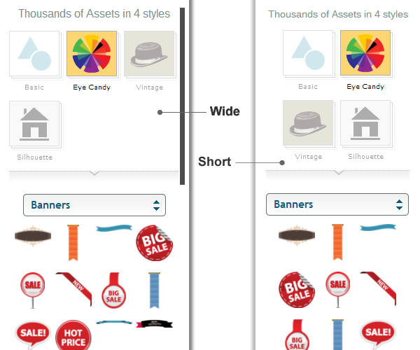
Responsive User Interface ; showing how left panel components size to fit a shorter width
What does it mean for our users?
In a nutshell regardless of which size display you access the application from, it will recognize your display size and automatically modify to give you the best possible viewing experience.
You see in the past if you had a resolution of say 1280X1024 (which is pretty common to most desktops) you would have to often collapse one of your left or right menus to see your entire project area specially when creating Presentations, or you would have to manually use scroll bars to find your way around different part os your project. But with our responsive interface you would no longer face this issue. This means you get a full visual representation of your stage and can concentrate on faster content creation.
Our users come from all walks of life. Some are students and teachers, some designers and small businesses and some just your average Joe who need to better translated their thoughts to visual content. Given the wide variety of display sizes we believe this was a much needed update and our users will enjoy a better overall experience creating awesome content.
Using Presenter the content creation process is not only intuitive but fun; everything the user does is visual and the application allows enough creative freedom to customize the content while keeping a balance with simplicity. it can be used by virtually anyone and to date thousands of Students and Teachers have become avid users, while Designers, Bloggers, Website owners and content creators alike are adopting it as the tool of choice to support their visualization needs.
We are inching closer to the upcoming rollout from Beta. Presenter is free to all users and can be accessed at www.ewcPresenter.com .
So take the latest version for a test drive and see what it can do for you.
 Payman Taei is the Founder of HindSite Interactive, an award winning web design and