


Let’s face it. We all want traffic. Lots of it.
Because without traffic, your website doesn’t solve its purpose.
Let’s say you’re a Biology teacher who also loves technology. You’re trying out some new online tools in class and see a boost in students’ performance when you blend lessons with these tools.
So you start a blog just to record and share your exciting findings. You review tons of free tools that you’ve used. Unbeknownst to you, this little blog is slowly attracting a decent traffic of 10,000 unique visitors a day. Soon you start getting “thank you” emails from other teachers looking for such resources online.
You also start hearing from other app developers asking you to trial their paid apps for free. Imagine what that could mean for you. You could start a sponsored app-review service. You can bundle up your blog posts and sell it as a report to your subscribers. You could even write an ebook on How-to use the top 5 tools in your market. Or make affiliate commissions from each app link.
The options are limitless.
Now what if you could boost this traffic to 20,000 visitors a day, making it an authoritative resource for Biology teachers looking for apps and software to use in class?
That would be fabulous! After all, your goal with the blog was always to make your findings usable. The more, the merrier. The good news is that you don’t have to spend a fortune on it either. Here’s how:
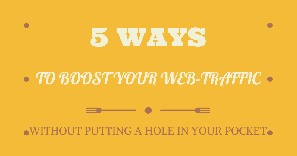
5 Ways to Boost Traffic to Your Website
1. Use Infographics
Infographics let you de-mystify complex data and present it in an easy to understand, digestible format.
After all, humans are wired for visual processing and learning.
Did you know that 90% of the world’s data has been created in the last two years alone?
This data comprises everything – seasonal changes, social media usage, stats from sport, online purchase patterns around the world, employee sick days, viral ads to name a few.
Enter infographics to save the day!
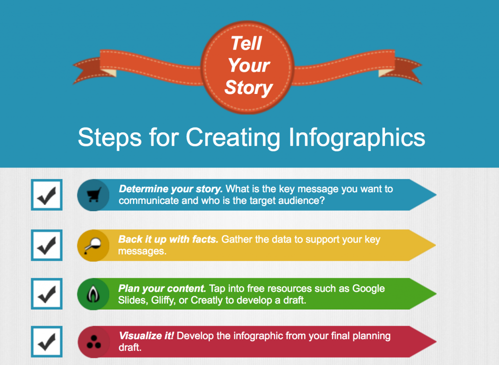
Infographics are not a new technology. Google Insights show that the word has been searched for years, since 2004. Here is one created in Visme that lays out steps to create an infographic. http://my.visme.co/projects/d9cb65
The best part if that an infographic allows for practical and easy data visualization. And yes, you don’t have to spend anything to create one with Visme.
2. Use Images
Try remembering a 12-digit long string of numbers. Hard to memorize, isn’t it? Try doing it with the help of visual mnemonic, and suddenly you have no memory problems.
Images talk to your individual readers and tell a story.
Photos generate 53% more likes on your Facebook post. Channels such as Google+ are driving more customer traffic to websites because of the visual punch.
What’s more, your articles with images will get 94% more views than the ones without any image! In local search, people are 60% more likely to buy from you if an image shows up in the listing. Here’s more proof in the form of an infographic.
 Source: http://www.mdgadvertising.com/blog/its-all-about-the-images-infographic/
You can also add quotes on custom-made images for added effect. Quozio is a good place to start creating images with text overlays and if you want more control you can use Visme.
A word of caution: By all means, stay away from “stock photos” of yesteryears with men in suits handshaking. Or worse yet, this:

Caption: What exactly is the point of this photo?
Source: Getty.com
Let’s all agree that stock photos don’t strike a conversation – and some of they are hideous to look at – and bid them goodbye! Not all stock photography is bad though. Photos of real people do a better job at conveying meaning.

HubSpot is giving away a collection of cool stock photos for free. Get them here. Here are some with the business theme.
3. Use Strong Calls-to-Action
If you’re running an online business, the surest and fastest way to boost sales is by increasing your conversion rate.
A conversion happens when a visitor does what you ought them to do in the first place. In case of our Biology professor, a desired action could be subscribing to the email list.
For such actions to happen, it’s your job to make it as easy for them to do it as you can. Think of it like breadcrumbs – you want to literally lay the right path for people to “click”, “buy’ or “subscribe”.
You can do it with call-to-action (CTA) buttons and images. Can you guess the desired call-to-action on the Visme home page?

On the landing page, we want new visitors to click the “Start Creating” button. It’s not by coincidence that color green of the CTA button stands out – it’s deliberate because we want the button to shout “Hey, over here!”
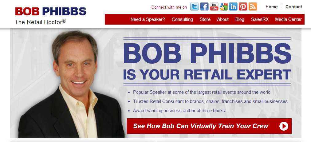
You want to do the same with your CTA buttons. Here’s another example. The CTA button uses a clear, benefit-driven copy “See how Bob can virtually train your crew”.
Create your new CTA for free now with Visme.
4. Create Massive Value Content
Gone are the days when “content was king”. With millions of websites living online, great content is king.
Engaging and building a community of followers for your online business takes time. Content marketing is a great way to shorten the distance between the two. With content marketing, you create stellar blog posts, write guest posts on other influencer blogs and reward your readers with massive value content.
First, understand what you stand for. Find your story and your voice. Then understand what your readers want. And give them that:
• Write useful list posts (like this one).
• Give a kickass webinar on your core topic (use Google Hangouts for free).
• Write an ebook and give it away to your audience.
• Do something epic.
Create something cool and then deliver.
5. Use the Right Colors
You’ve heard it before. Colors play a role in attracting readers to your blog.
That’s why there is so much importance on colors when doing designs. Although that’s true, it’s not the truth.
When taking colors into consideration, do not forget where they will be used – i.e. the context. A color that converts well for your competitor won’t necessarily do the same for you. Your colors need to tie everything together and present it in a great package that’s instantly likeable.
Sounds like a tall order? Would it complicate the matters more if I said color-choice also depends on the person viewing, their background, culture, gender and more? So yellow doesn’t always mean happy and blue doesn’t necessarily convey trust.
For example, red could mean bold but when designing a signup form, red is for failure. Green can mean growth in one context but mean success in the same form. Here’s an example from Twitter’s signup page where red means failure and green means success:
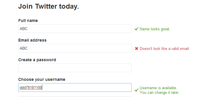
Since Twitter is using the right colors associated in this context, they save people’s time and this reflects positively on their app.
The only way to know whether you’re using the “right” colors is by doing constant A/B tests on your website.
(If you don’t know how to do it, this is a great resource to start with. Or you can invest in a web developer to help you out).
Your Turn
Of course, there are many more ways to boost your website traffic, and I’ll talk about them in future posts. I am curious what ways have you tried and what works best for you? Let me know in the comments.
Pooja Lohana is the Content Marketing Manager at Visme. Follow her at Google+ or learn more about her on her website.
